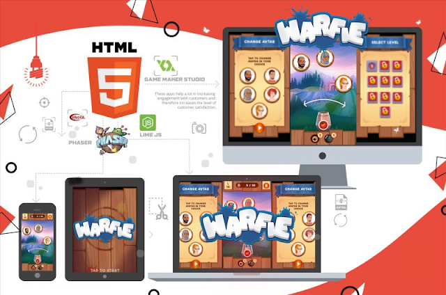
The world of HTML5 game development is brimming with creative possibilities. You can craft engaging experiences that range from fast-paced action adventures to strategic puzzle games. But as mobile gaming continues its explosive growth, ensuring your game thrives on these pocket-sized powerhouses becomes crucial. This is where optimization comes in, transforming your HTML5 game into a mobile masterpiece.
Why Optimize for Mobile?
Did you know? Over 90% of mobile web traffic originates from smartphones and tablets. Optimizing your HTML5 game for these devices is no longer an afterthought; it’s essential for reaching your target audience in the ever-expanding mobile gaming market.
Here’s why optimization is vital for your HTML5 game’s mobile success:
-
Performance: Mobile devices have varying processing power and memory limitations compared to desktops. Optimizing your game ensures smooth gameplay without lag or crashes, keeping players engaged.
-
Touch-Friendly Experience: Mobile interfaces are smaller and require intuitive touch controls. Optimization ensures your game’s interface and controls are user-friendly on touchscreens.
-
Accessibility Across Devices: A vast range of devices with different screen sizes and resolutions exists. Optimization ensures your game adapts and displays properly across various mobile platforms.
By prioritizing mobile optimization, you can ensure your HTML5 game flourishes in the mobile gaming landscape.
Understanding the Mobile Battlefield
Optimizing HTML5 games for mobile devices presents unique challenges that require specific strategies:
-
Resource Constraints: Mobile devices typically have less processing power, memory, and battery life compared to desktops. This means your game needs to be efficient and minimize resource usage. Oversized files or complex code can quickly lead to performance issues on mobile devices.
-
Touch Controls: Traditional keyboard and mouse controls don’t translate well to touchscreens. You need to design intuitive touch-based controls for a seamless mobile experience. Imagine navigating a complex strategy game with a clunky virtual joystick – not ideal!
-
Device Fragmentation: The mobile landscape is vast, with a wide range of devices, operating systems, and screen sizes. Your game needs to adapt to different screen resolutions and device capabilities. A game designed for a high-resolution tablet might appear pixelated and unplayable on a budget smartphone.
By understanding these challenges, you can develop a strategic approach to optimizing your HTML5 game for mobile domination.
Your Mobile Optimization Arsenal: Strategies for Success
Here are key strategies to optimize your HTML5 game for mobile devices and ensure it conquers the mobile market:
-
Code Optimization: Streamline your code by removing unnecessary elements and utilizing efficient coding practices. This reduces the game’s file size and improves performance on mobile devices. Consider using libraries specifically designed for mobile development, as they often incorporate performance optimizations.
-
Asset Optimization: Images, audio, and other game assets can significantly impact file size. Utilize image compression techniques without sacrificing visual quality. Optimize audio formats for mobile playback, and consider using lower-resolution assets on mobile devices. Tools like sprite sheets can help reduce the number of image files needed, further improving performance.
-
Touch Control Mastery: Design intuitive touch controls that are responsive and easy to use on a touchscreen. Consider virtual buttons, swipe gestures, and tap mechanics tailored for mobile gameplay. Experiment with different control layouts and gather feedback from playtesters to ensure your controls are comfortable and intuitive.
-
Responsive Design is Your Ally: Implement a responsive design that adapts your game’s layout and user interface to different screen sizes and resolutions. This ensures a clean and playable experience on various mobile devices. Use CSS media queries to adjust the layout and styling based on the screen size, ensuring your game looks and functions flawlessly across different devices.
-
Offline Play (Optional): Consider offering an offline play option, especially for games that don’t require constant internet connectivity. This allows users to enjoy the game even without an internet connection, a valuable feature for mobile gaming on the go. This functionality can be particularly attractive for board game adaptations, allowing players to enjoy the game during commutes or while traveling.
Remember: Test your game thoroughly on a variety of mobile devices to identify and address any optimization issues that might hinder the gameplay experience. Utilize real devices or emulators to simulate different screen sizes and performance capabilities.
Board Game Adaptations: Optimizing for the Digital Tabletop
While the above strategies apply to all HTML5 games, consider these additional points for optimizing digital board game adaptations:
-
Readability on Small Screens: Ensure text elements like card descriptions and game rules are clear and readable on small mobile screens. Utilize larger fonts, clear layouts, and consider offering zoom functionality for detailed information.
-
Turn Management on the Go: Design a streamlined turn management system that is intuitive and translates well to a touch-based interface. Consider turn timers or notification systems for a smooth flow of gameplay. Clear indicators should show whose turn it is, and actions should be easy to perform with taps or swipes.
-
Multiplayer Considerations: If your digital board game offers online multiplayer, optimize for smooth network communication and minimize data usage to ensure a lag-free experience on mobile connections. Implement efficient network protocols and consider turn-based gameplay instead of real-time to reduce data exchange.
By incorporating these board game-specific considerations, you can create a mobile-optimized digital experience that faithfully captures the essence of the classic board game while thriving in the mobile gaming world.
Conclusion: Claiming Victory on the Mobile Battlefield
Optimizing your HTML5 game for mobile devices unlocks a vast audience and elevates your creation to a new level. By following the strategies outlined above, you can ensure your game runs smoothly, offers an intuitive user experience, and adapts to various mobile devices. Remember, a well-optimized mobile game is key to captivating players and establishing a foothold in the ever-evolving mobile gaming market. So, embrace the challenge, optimize strategically, and watch your HTML5 game conquer the mobile battlefield!